POPUP ELEMENT GUIDE
A popup is a user interface element that overlays the main content of a webpage, providing additional information, options, or actions without requiring users to navigate to a different page. Below, you'll find clear instructions on how to create and use a popup element:
Creating a Popup Element
Step 1: Begin by dragging and dropping the popup element anywhere within your builder. You'll be prompted to rename your popup element; once you're done, click "Done."
Step 2: After completing the initial setup, you'll have the option to select the type of link popup you'd like to use. Once you've made your choice, simply click the "Done" button.
Step 3: You will be automatically directed to a blank popup page. Here, you can add various elements, forms, or layout elements by easily dragging your chosen elements into the popup area.
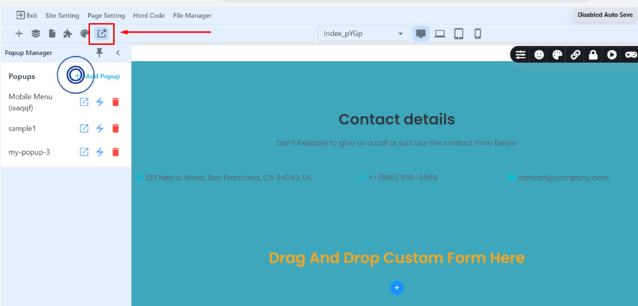
Tip: You can also access the Popup Manager, located in the upper left corner of your screen (as indicated by the icon shown below), to create a popup.
Using the Popup Element
Keep in mind that you have the flexibility to choose the type of popup link you want to use. Here's a breakdown of the options available to guide you:
-
EXIT INTENT: This popup triggers when the user moves the mouse out of the screen.
-
SCROLL DEPTH: The popup activates when the user scrolls to a specific part of the page.
-
CUSTOM: If you want to create a customized popup linked to a specific element, follow these steps:
- Select the button to which you want to link your popup.
- Click on the button; settings will appear.
- Click on the "chain" icon to establish the link, then choose the popup option.
- A dropdown menu will appear with options to display popup names. Choose the popup name you want to link to that button.
- Once you've finished, click the "DONE" button, and you're good to go.
By following these comprehensive instructions, you'll be well-equipped to effectively utilize and customize popups for your project. Happy designing!