SWITCHER ELEMENT
Refers to a user interface element or component that allows users to easily switch from one page or area to another within a website.
To use the switcher element, simply drag and drop the element anywhere inside your screen or layout.
Click on the switcher box to edit, once done, the switcher settings will automatically pop-up.
Tabs, by clicking the tabs you can edit the text inside and you can also put some elements that you want on a certain tab.
SWITCHER POP-UP SETTINGS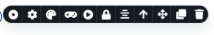
1. SWITCHER
This option is where you can edit the style and the spacing of your tabs/switcher.
2. Access the gear icon in this field to configure the size, gap, and padding of your tabs/switcher:
Size: Modify the dimensions (width and height) of individual elements on your webpage.
Gap: Define the spacing between rows and columns in grid or flex layouts.
Padding: Set the space between an element's content and its border.
3. COLOR
Color is a powerful design element used in a wide range of contexts, including web design , graphic design, branding, marketing and more. It plays a crucial role in conveying information, exciting emotions, and creating a visual harmony. This is where you can change the color of your tab/switcher's background, text, border, or shadow.
4. Transform
The transformations property can be used alongside transitions to create visually appealing interactions.
5. Animations
Employ this feature to infuse dynamic and visually engaging moments or changes into elements on your webpage. It captures user attention, enhances the user experience, and makes your website more interactive and attractive.
6. Toggle Free Form Drag Positioning:
This enables you to move elements by clicking and dragging them with a mouse cursor. The term "freeform" indicates that users have greater flexibility and control over the positioning of these elements, often without predefined alignment or snapping.
7. Center Alignment
This option allows you to align your text to the left, right, center, or justify it.
Refers to a user interface element or component that allows users to easily switch from one page or area to another within a website.
To use the switcher element, simply drag and drop the element anywhere inside your screen or layout.
Click on the switcher box to edit, once done, the switcher settings will automatically pop-up.
Tabs, by clicking the tabs you can edit the text inside and you can also put some elements that you want on a certain tab.
SWITCHER POP-UP SETTINGS

1. SWITCHER
This option is where you can edit the style and the spacing of your tabs/switcher.
2. Access the gear icon in this field to configure the size, gap, and padding of your tabs/switcher:
Size: Modify the dimensions (width and height) of individual elements on your webpage.
Gap: Define the spacing between rows and columns in grid or flex layouts.
Padding: Set the space between an element's content and its border.
3. COLOR
Color is a powerful design element used in a wide range of contexts, including web design , graphic design, branding, marketing and more. It plays a crucial role in conveying information, exciting emotions, and creating a visual harmony. This is where you can change the color of your tab/switcher's background, text, border, or shadow.
4. Transform
The transformations property can be used alongside transitions to create visually appealing interactions.
5. Animations
Employ this feature to infuse dynamic and visually engaging moments or changes into elements on your webpage. It captures user attention, enhances the user experience, and makes your website more interactive and attractive.
6. Toggle Free Form Drag Positioning:
This enables you to move elements by clicking and dragging them with a mouse cursor. The term "freeform" indicates that users have greater flexibility and control over the positioning of these elements, often without predefined alignment or snapping.
7. Center Alignment
This option allows you to align your text to the left, right, center, or justify it.
8. Select Parent Element
Use the "Arrow Up" button to select the parent element, targeting the container or enclosing element that holds a specific HTML element within the webpage's document structure.
9. Move
Utilize the icon resembling a cross with an arrowhead to relocate an element to your preferred location within the section of your layout.
10. Clone
Easily duplicate or copy your text element.
11. Trash Bin Icon:
Delete a specific element when it's no longer needed.
These comprehensive instructions and explanations should empower you to effectively utilize and customize forms within the Web Builder for your project.